Designing inside LinkedIn’s system
I kept copying my LinkedIn connections into a Notion board by hand just to keep them organized. The platform had no way to manage a network in place, so I redesigned the Connections page to handle it: custom filters, profile tagging, and bulk messaging, all designed to look like they already belong in LinkedIn.
Professionals rely on LinkedIn to build and keep up with their networks, but the Connections page is basically a flat list with no way to group people, tag them, or act on more than one at once. Anyone who manages their network seriously ends up doing it somewhere else: a spreadsheet, a Notion board, a CRM. This concept brings that work back onto LinkedIn with flexible tagging and filtering plus bulk messaging, which keeps people on the platform and makes the networking itself far less tedious.
Three things slowing people down
Messaging happens one person at a time. There’s no way to select a set of connections and contact them together, so any kind of batch outreach is slow and entirely manual.
Connections sit in a single undifferentiated list. You can’t group them, label them, or collapse what you don’t need, so finding the right person means scrolling, searching, and scrolling again.
What little filtering exists is fixed. You can’t build categories around how you actually think about your network, so the system never quite fits the way any one person works.
New capability, native to LinkedIn
I wasn’t trying to reinvent LinkedIn, just add a capability it’s missing. Every piece is built from LinkedIn’s own components, spacing, and color, close enough to the real product that it could pass for something the team already shipped.
Filter overhaul
I rebuilt the Connections filter bar around collapsible categories, so the workspace stays tidy, with a search field to jump straight to a filter or tag. An “Add New Filter” flow lets you spin up custom categories with their own tags, removable on hover, so the filtering matches how you actually group people.
Profile tags
Tagging lives right on the profile card and feeds straight into the filter sidebar. Hit “Tags” on any connection to open a quick modal, search to find, add, or remove tags, and every tag you create becomes something you can filter by.
Messaging modal
Select a few connections with the card checkboxes and a message modal opens with them already added as recipients, name chips up top, plus an optional group name. A toggle switches between “Group Chat” (one shared thread) and “Bulk Message” (the same note sent individually), so one flow covers both ways people actually reach out.
The decision I’m most proud of was cutting my best-looking idea. My first filter component was bold and obviously “designed.” In testing, people couldn’t tell it was part of LinkedIn, so they hesitated to use it. I scrapped it and rebuilt the feature out of LinkedIn’s own patterns. Blending in was the whole point.
When the obvious research dried up
My first research plan dead-ended fast: secondary data was thin, and the closest competitor I could study, Xing, banned my account almost immediately. So I went straight to people: five interviews with LinkedIn users who manage their networks in different ways. Those conversations are where the real insight came from, and they shrank the project from an ambitious two-concept A/B test down to one focused redesign.
From flashy to familiar
Here’s what that looked like in the designs. The first version introduced a brand-new tag component that was distinct and eye-catching, but foreign to everything around it. In testing, users couldn’t connect it to the rest of the page, and navigation actually got harder. The refined version is a plain “Tags” button that borrows LinkedIn’s existing patterns: plainer, and people got it right away.
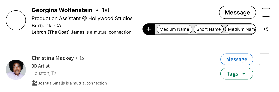
The bold tag bar looked distinct and exciting, but testing showed users couldn’t connect it to the rest of the interface, so navigation got harder.
A simple “Tags” button that mirrors LinkedIn’s existing design language. Familiar enough that people knew what it did on sight.
Play with the prototype
Live front-end prototype: filter, tag, and bulk-message real connection cards. Built in React from the final designs.
Open full size ↗What I’m taking forward
On an established product, the strongest idea is often the one people already recognize. Designing inside LinkedIn’s patterns did more for usability than any original component I drew, and it’s the same instinct I’d bring to any team’s design system.
I planned a two-concept A/B test; five interviews told me that was overbuilt. Scoping from what users actually said, instead of what I assumed, kept the project focused enough to finish well.
I validated the screens, but never tested the redesign against LinkedIn’s real constraints: existing data, edge cases, engineering cost. Next time I’d pressure-test feasibility, not just usability.